Classic layout
The 'classic' layout is the default layout. So let's start by taking a look at the default calendar generated:
$ callirhoe default.pdfClick on this link to get the generated file, here is a screenshot of it: 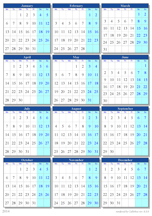
Same as above, but in landscape mode (3x4). To me, it looks better, for printing. But for screen viewing, you will have to rotate the page in your pdf viewer.
$ callirhoe --landscape default-landscape.pdf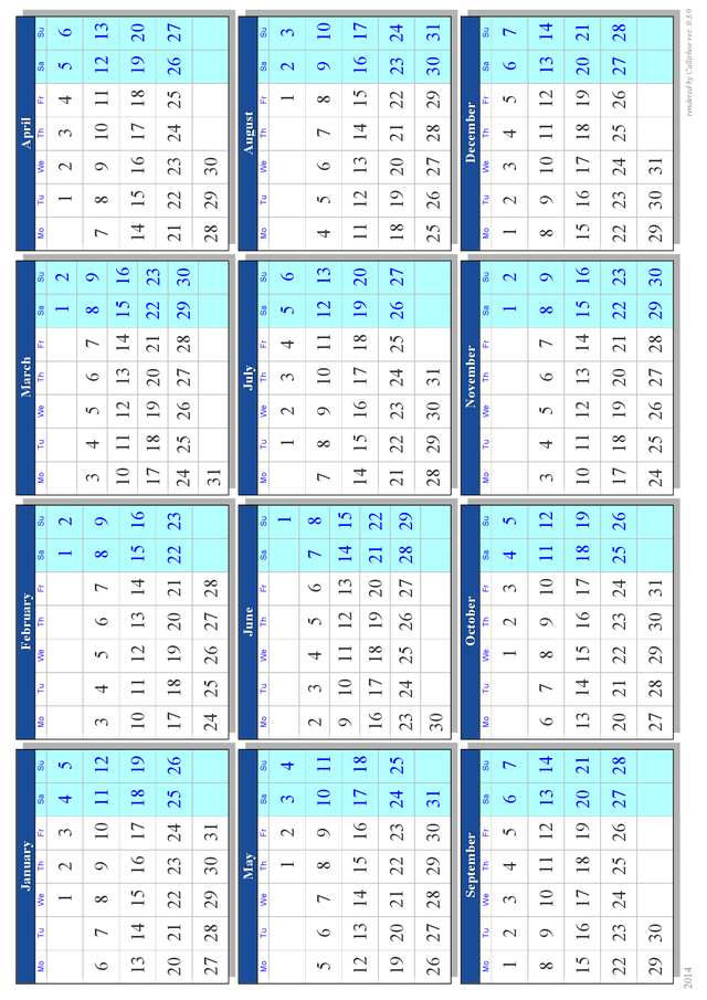
To create a rotated pdf appropriate for screen viewing, you have to specify a pseudo-a4 page with width > height. The shortcut "a4w" becomes handy (see the program arguments documentation for more information).
$ callirhoe --paper=a4w --rows=3 default-rot.pdf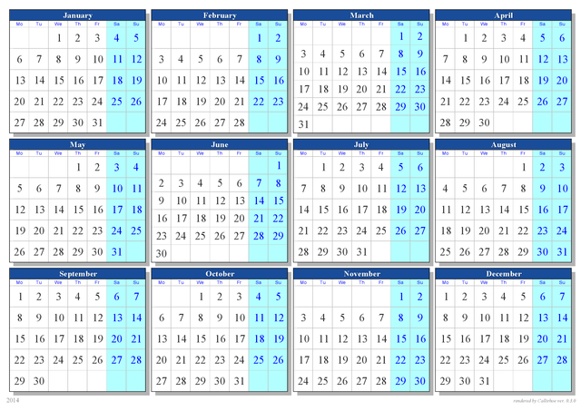
How about rainbow color style and sloppy geometry?
$ callirhoe --paper=a4w --rows=3 -s rainbow -g sloppy default-rot-sloppy.pdf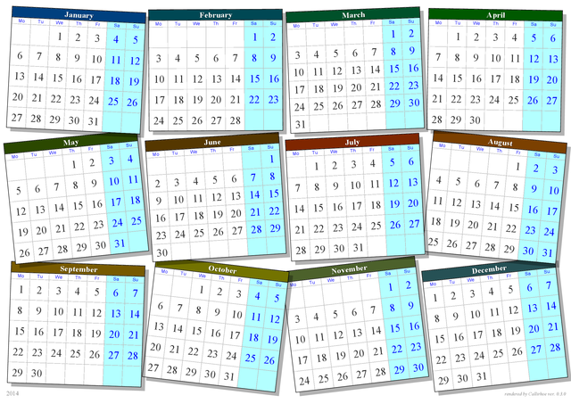
Curious about plain black & white style?
$ callirhoe --paper=a4w --rows=3 -s bw default-bw.pdf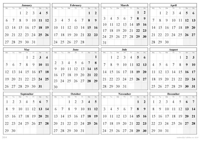
Bars layout
Now add option -t bars to the examples above, to enable "bars" layout. Bars is using by default 2 rows.
$ callirhoe -t bars bars.pdf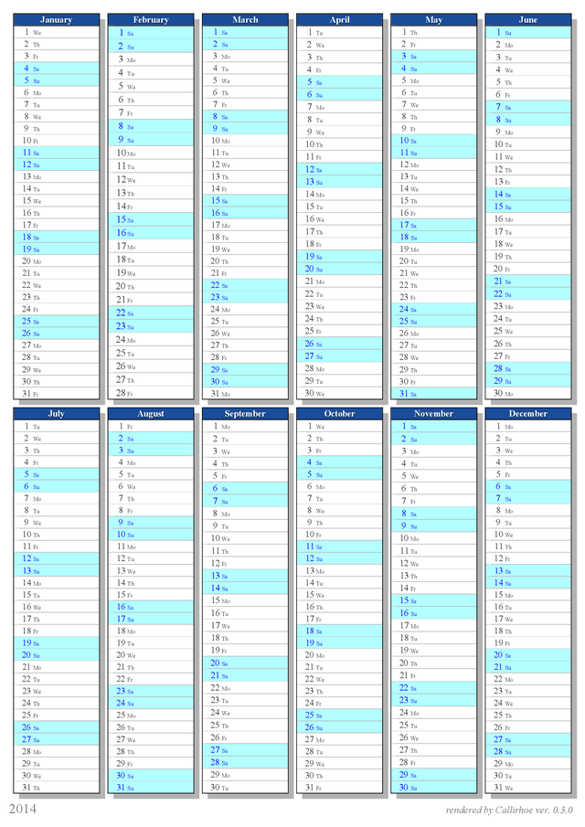
Or rotated (landscape):
$ callirhoe --paper=a4w -t bars --rows=1 bars-rot.pdf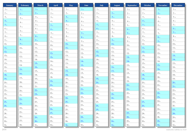
Maybe disable shadows and try smaller padding. And let's use the rainbow color style:
$ callirhoe --paper=a4w -t bars --rows=1 --padding=0.5 --no-shadow -s rainbow bars-rot-pad.pdf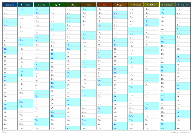
Or just use plain bw style:
$ callirhoe --paper=a4w -t bars --rows=1 -s bw bars-bw.pdf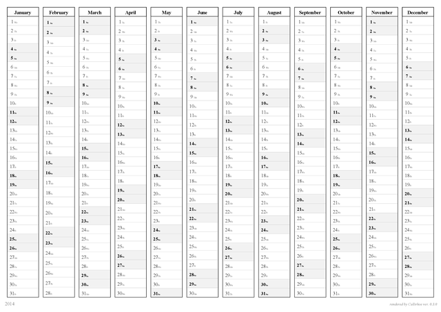
Sparse layout
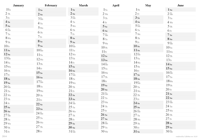
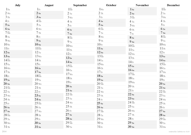
Sparse layout is similar to bars layout but gives a more flat look and may also consume more space. Note that you should use the bw_sparse style with this layout.
$ callirhoe --paper=a4w -t sparse -s bw_sparse --cols=6 sparse-rot.pdfSince we ask for 6 months/page, we get a 2-page pdf file for the whole year: 